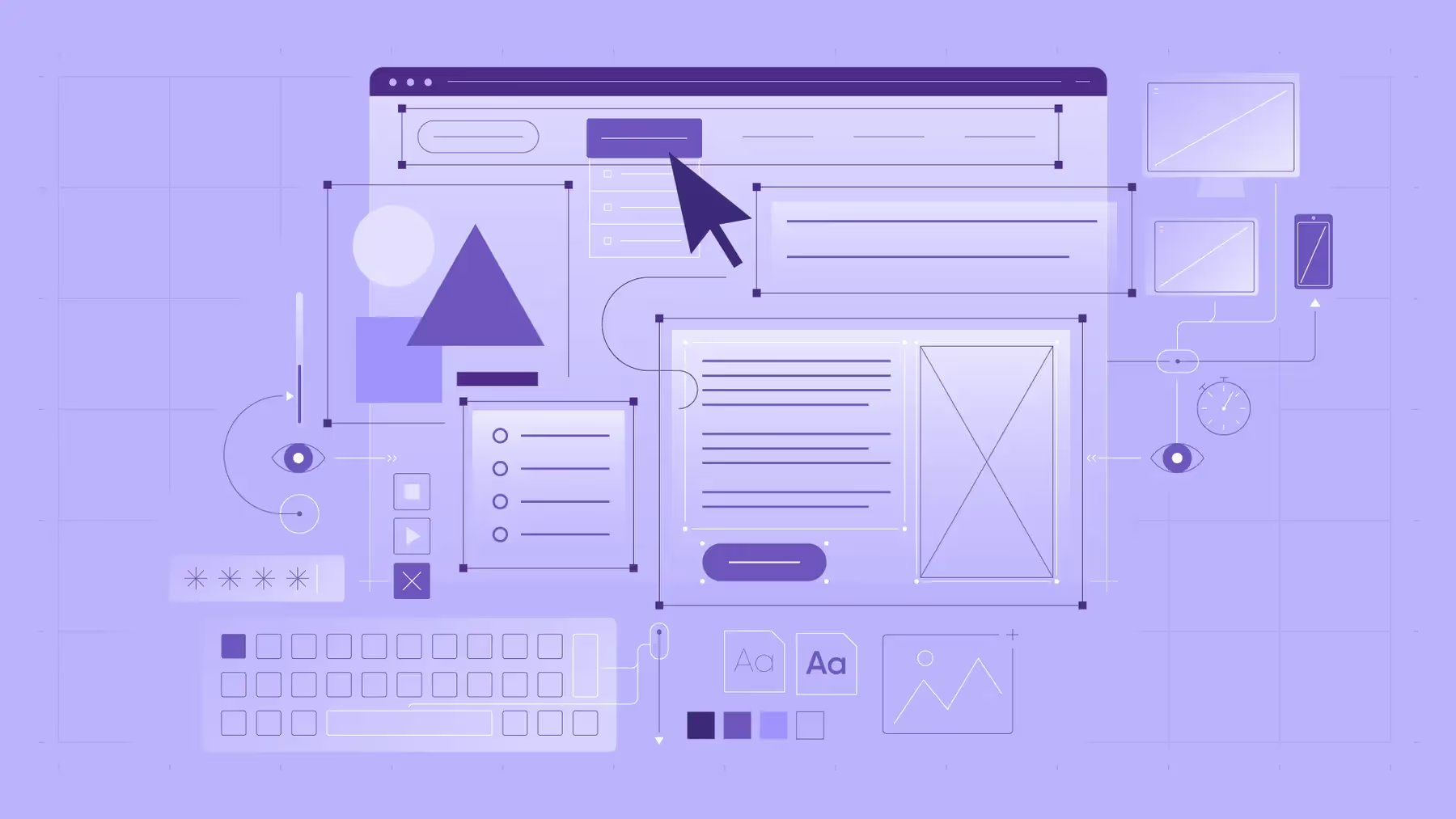
Infographic: Anatomy of a well designed website

Key graphic elements to make your website stand out
Creating a killer website isn't one-size-fits-all. Businesses that want to stand out have to craft unique messaging and experiences. But these key ingredients lay the foundation for top-notch, high-converting websites.
1. Guiding visuals
20% of your content will be read. At the same time, 61% of users will move on to another site if they don’t find what they want right away.
Regardless of your visitors’ goals, they’re likely skimming — commonly in the F or Z pattern.
Visual hierarchy guides users to what they’re looking for. Put your most important and descriptive content front and center, punctuated with actionable CTAs. Emphasize important elements with size, colour, and positioning to influence how users interact.

2. Eye-catching graphics
50 milliseconds.
That’s the time it takes for users to form an impression of your brand’s authority.
Harness attention with high-quality graphic elements, engaging headlines, striking fonts, and interactive features. Visuals not only create an enjoyable experience — they also contribute to your brand’s reputation.
3. Intuitive navigation
94% of users prioritize simple navigation.
It’s great to get creative and provide a unique experience. But that doesn’t mean your site should be a chore for users. Arrange content logically, with clearly defined sections and headings.
Build a user-friendly interface with a clear and organized navigational menu structure that gives visitors easy access to your entire site.
4. Responsive, mobile-first design
50% of your returning customers would use your site more if it were mobile-friendly.
Users expect a seamless user experience across all platforms and will hop ship for a competitor if they don’t get it. Responsive design makes your site mobile-friendly by adjusting to different devices.
Plus, a mobile-first design helps your SEO since Google predominantly indexes and ranks based on your mobile site's content.


5. Engaging content
That much content buries yours and overwhelms audiences. Make your content compelling and relevant enough to grab and maintain interest.
Beware of issues that stunt great ideas: huge blocks of text, lack of visuals, poor structure, and on and on.
Mix text, images, videos, and interactive elements to engage users.

6. Well-structured layout
64% of users prefer a simple website design.
Part of that means not overcrowding your site. White space is your best friend, enhancing readability, avoiding clutter, and making your visuals pop.

7. Clear call-to-action
70% of SMBs don’t have a CTA button on their homepage — don’t be them!
CTAs should be prominent and encourage visitors to take specific actions. Don’t make your primary compete with secondary CTAs or other buttons. Narrow your page’s flow, navigation, and structure to work together toward a unified goal.

8. Fast loading speed
3x higher conversion rates.
That’s the difference between sites that load in 1 second compared to 5 seconds.
These days, a slow site is plain unacceptable. Optimize your website's performance to minimize loading times.
Compress images, minimize code, and use caching techniques to improve speed.

9. Consistent branding
Don’t get lost in the pool of competition.
Your brand identity should create a cohesive visual experience. Maintain a consistent colour scheme, typography, and overall design throughout your site.
Custom-made illustrations and other graphic elements make your brand instantly recognizable.

10. Trustworthy elements
Brands run on social cred.
Include trust signals like customer testimonials, security badges, and certifications throughout your site to build credibility and inspire confidence.

11. An expert web design agency
The Digital Panda creates websites and digital experiences that cut through the noise and tell your unique brand story.


.webp)