Brand refresh for Axelar

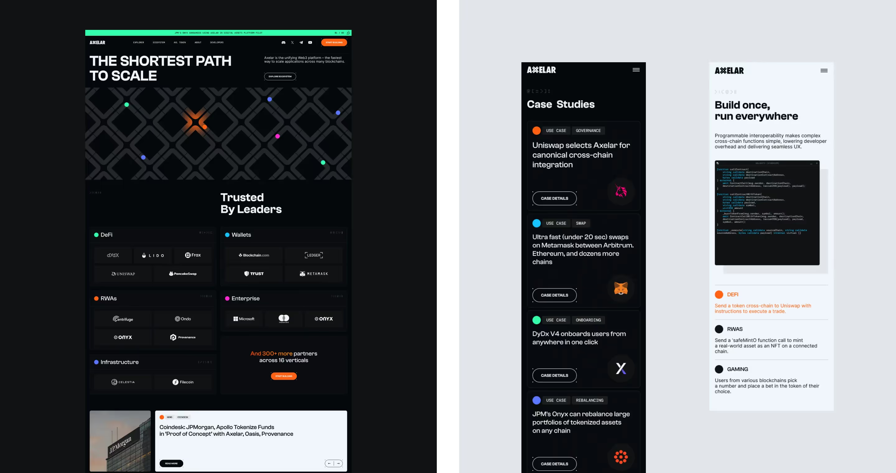
Axelar, a leader in blockchain interoperability, tasked us with re-imagining their visual and digital presence. Their multichain platform enables users to deploy and manage applications with fungibility and native functionality across multiple EVM chains. Our goal was to create a dynamic, industry-elevating digital presence with comprehensive visual storytelling.

Client
Axelar
Location
Global
Industry
Blockchain
Size
30

Breaking down Barriers in Blockchain.

Services
Illustration
Motion Design
User Experience
Web Development
Strategy
Branding
UI Design
The challenge

Axelar challenged us with creating a digital presence that clearly communicates their complex technology and value proposition. The new design needed to establish Axelar as a trusted leader in the blockchain space. This involved simplifying intricate concepts for diverse audiences while maintaining a professional and engaging aesthetic.

Our approach
Strategy
Our journey began with a deep dive into Axelar's technology and the needs of their audience. We needed to communicate the benefits of their platform and interoperability solutions. We discovered that the key was to present their complex technology in an accessible and engaging way, emphasizing security, scalability, and ease of integration.
UX Design
Our UX design aimed to create a seamless journey for users. We focused on intuitive navigation and clear information hierarchy. The user experience was crafted to highlight Axelar's core features and benefits, guiding users through their platform's capabilities with ease.
UI Design
We set out to create a UI design that provides a visual narrative conveying Axelar's innovation and leadership in the blockchain space. This involved seamlessly blending the branding elements and interaction design to direct users and tell Axelar’s story.
Branding
The modern and bold colour palette and typography reflects the blockchain industry. We incorporated Axelar’s branding elements to create a cohesive and professional look while introducing playful visuals to make complex concepts more approachable.
Concept & iterations

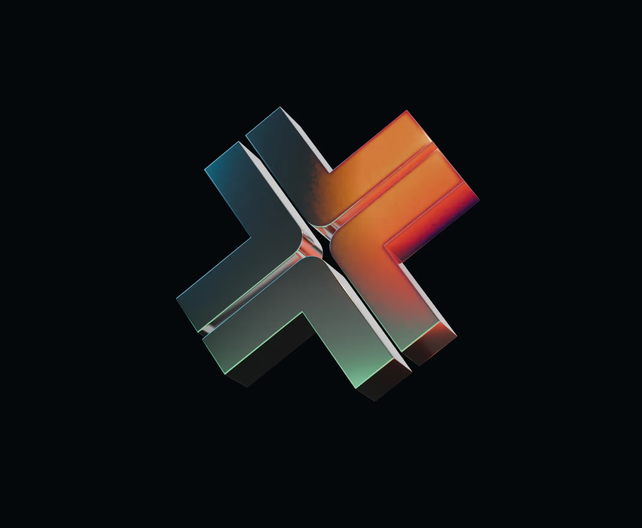
We tied Axelar’s logo, colour palette, and other branding elements together to tell the story of interoperability and transfer. The orange ball acts as a hero that guides users through the website, symbolizing the seamless connectivity Axelar provides.

We experimented with several interactions and concepts, playing with the idea of metal and transformation, before nailing down the “pathways” idea.

Structure, layout, & flow

We structured the site’s content and layout in clear and concise wireframes, ensuring a logical flow of information.

Playfully bold branding

We chose modern, bold colours and fonts that resonate with the crypto industry. We balanced professional with playful to elevate Axelar in the industry, while communicating concepts to various audiences.

Interactions in all dimensions

We experimented with various interactions and animations to bring the digital experience to life. Scroll animations and motion graphics illustrate Axelar's functionality and benefits. These interactive elements keep users engaged and enhance their understanding of the platform.


Scroll animations and motion graphics  make the website more engaging and visually explain Axelar's technology.

Looking to connect your audience?

Let's take it to the next level

But wait... there's more 🖼️

Motion Design System for Webflow

Potential Motors

MINDCURE

Let's make something 🔥